Work

  /  

hare

hare

hare

hare

hare

hare

hare

A visual exploration: an identity for a running brand, inspired by the painted miniatures of Werner Bronkhorst.

A visual exploration: an identity for a running brand, inspired by the painted miniatures of Werner Bronkhorst.

Services

Visual exploration

Scope

Mark, wordmark, image world, presentation board

Year

2026

Tools

Figma

hare

The exercise

The exercise

The exercise

The exercise

The exercise

A self-initiated exercise, inspired by Werner Bronkhorst’s thick-paint miniatures. We wanted to see how a running brand would feel if every image was a landscape of paint with tiny runners crossing it. hare is the result: a mark, a wordmark and an image world, set out as a brand.

The idea

The idea

The idea

The idea

The idea

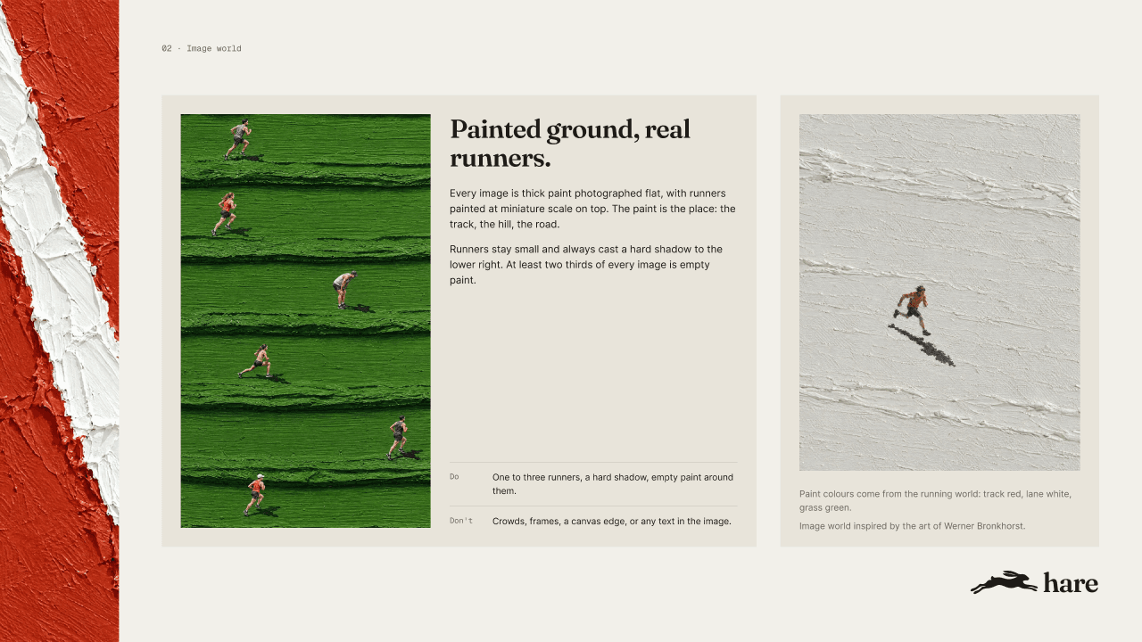
Thick palette-knife strokes form the track, the hill and the road, and tiny painted runners cross them.

Key decisions

Key decisions

Key decisions

Key decisions

Key decisions

01

A leaping hare

Why

Running brands lean on abstract swooshes and speed lines.

Effect

One silhouette of a hare mid-leap suggests speed, and still reads at the size of a shoe tab.

02

Paint as the landscape

Why

Sports photography tends to look the same from brand to brand.

Effect

Thick paint gives every image a texture you can almost feel, with two thirds of each one left as empty paint. The approach follows Bronkhorst’s work.

03

A serif wordmark

Why

Sports wordmarks are almost always heavy, slanted sans serifs.

Effect

Fraunces in lowercase feels crafted, which suits images made by hand.

01

A leaping hare

Why

Running brands lean on abstract swooshes and speed lines.

Effect

One silhouette of a hare mid-leap suggests speed, and still reads at the size of a shoe tab.

02

Paint as the landscape

Why

Sports photography tends to look the same from brand to brand.

Effect

Thick paint gives every image a texture you can almost feel, with two thirds of each one left as empty paint. The approach follows Bronkhorst’s work.

03

A serif wordmark

Why

Sports wordmarks are almost always heavy, slanted sans serifs.

Effect

Fraunces in lowercase feels crafted, which suits images made by hand.

01

A leaping hare

Why

Running brands lean on abstract swooshes and speed lines.

Effect

One silhouette of a hare mid-leap suggests speed, and still reads at the size of a shoe tab.

02

Paint as the landscape

Why

Sports photography tends to look the same from brand to brand.

Effect

Thick paint gives every image a texture you can almost feel, with two thirds of each one left as empty paint. The approach follows Bronkhorst’s work.

03

A serif wordmark

Why

Sports wordmarks are almost always heavy, slanted sans serifs.

Effect

Fraunces in lowercase feels crafted, which suits images made by hand.

01

A leaping hare

Why

Running brands lean on abstract swooshes and speed lines.

Effect

One silhouette of a hare mid-leap suggests speed, and still reads at the size of a shoe tab.

02

Paint as the landscape

Why

Sports photography tends to look the same from brand to brand.

Effect

Thick paint gives every image a texture you can almost feel, with two thirds of each one left as empty paint. The approach follows Bronkhorst’s work.

03

A serif wordmark

Why

Sports wordmarks are almost always heavy, slanted sans serifs.

Effect

Fraunces in lowercase feels crafted, which suits images made by hand.

01

A leaping hare

Why

Running brands lean on abstract swooshes and speed lines.

Effect

One silhouette of a hare mid-leap suggests speed, and still reads at the size of a shoe tab.

02

Paint as the landscape

Why

Sports photography tends to look the same from brand to brand.

Effect

Thick paint gives every image a texture you can almost feel, with two thirds of each one left as empty paint. The approach follows Bronkhorst’s work.

03

A serif wordmark

Why

Sports wordmarks are almost always heavy, slanted sans serifs.

Effect

Fraunces in lowercase feels crafted, which suits images made by hand.

01

A leaping hare

Why

Running brands lean on abstract swooshes and speed lines.

Effect

One silhouette of a hare mid-leap suggests speed, and still reads at the size of a shoe tab.

02

Paint as the landscape

Why

Sports photography tends to look the same from brand to brand.

Effect

Thick paint gives every image a texture you can almost feel, with two thirds of each one left as empty paint. The approach follows Bronkhorst’s work.

03

A serif wordmark

Why

Sports wordmarks are almost always heavy, slanted sans serifs.

Effect

Fraunces in lowercase feels crafted, which suits images made by hand.

Brand identity slide

The presentation board: mark, wordmark, colour and the painted image world on one page.

Brand identity

Brand identity

Brand identity

Brand identity

Brand identity

Brand identity

The mark, the wordmark, the image world and colour, and how they work on cards and a banner.
02Image world
03Three cards
04The track
05Banner
06Colour
02Image world
03Three cards
04The track
05Banner
06Colour
02Image world
03Three cards
04The track
05Banner
06Colour
02Image world
03Three cards
04The track
05Banner
06Colour
02Image world
03Three cards
04The track
05Banner
06Colour
02Image world
03Three cards
04The track
05Banner
06Colour

The system

The system

The system

The system

The system

The system

Lane white is the page. Track red leads, grass green and ink support it.

Lane white

#F2F0EA

Track red

#C63A24

Grass green

#3F7021

Ink

#1F1B17
Typeface specimen

Fraunces and Inter

Display and text