Work

  /  

Aqueduct

Aqueduct

Aqueduct

Aqueduct

Aqueduct

Aqueduct

Aqueduct

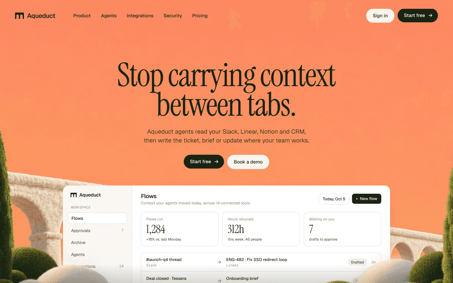
A website and brand for an AI agent platform that has to explain itself in one screen.

A website and brand for an AI agent platform that has to explain itself in one screen.

Services

Website, brand identity

Scope

Homepage, mark, guidelines

Year

2026

Tools

Figma

Aqueduct

The brief

The brief

The brief

The brief

The brief

Aqueduct makes software agents that carry work between the tools a company already uses. The challenge was to make an invisible, technical product feel tangible. The site needed one clear message in its first screen, a warm, friendly look, and enough of the real product to show it works.

The idea

The idea

The idea

The idea

The idea

An aqueduct carries water from where it collects to where people need it. Aqueduct does the same with information, moving it between a company’s tools.

Key decisions

Key decisions

Key decisions

Key decisions

Key decisions

01

Soft felt scenes

Why

The category is dark, glowing and abstract, which reads as complex and slightly cold.

Effect

Warm, tactile scenes make an infrastructure product feel calm and approachable, and it stands out next to its competitors.

02

The product sits inside the world

Why

The product has to be seen to be believed, but a raw dashboard on its own looks like every other tool.

Effect

The sharp interface stands out against the soft scenery, so it’s the first thing people look at.

03

Apricot in every image

Why

One strong colour is easier to remember than a palette.

Effect

The brand is recognisable from a single cropped image, and the interface stays quiet and legible.

01

Soft felt scenes

Why

The category is dark, glowing and abstract, which reads as complex and slightly cold.

Effect

Warm, tactile scenes make an infrastructure product feel calm and approachable, and it stands out next to its competitors.

02

The product sits inside the world

Why

The product has to be seen to be believed, but a raw dashboard on its own looks like every other tool.

Effect

The sharp interface stands out against the soft scenery, so it’s the first thing people look at.

03

Apricot in every image

Why

One strong colour is easier to remember than a palette.

Effect

The brand is recognisable from a single cropped image, and the interface stays quiet and legible.

01

Soft felt scenes

Why

The category is dark, glowing and abstract, which reads as complex and slightly cold.

Effect

Warm, tactile scenes make an infrastructure product feel calm and approachable, and it stands out next to its competitors.

02

The product sits inside the world

Why

The product has to be seen to be believed, but a raw dashboard on its own looks like every other tool.

Effect

The sharp interface stands out against the soft scenery, so it’s the first thing people look at.

03

Apricot in every image

Why

One strong colour is easier to remember than a palette.

Effect

The brand is recognisable from a single cropped image, and the interface stays quiet and legible.

01

Soft felt scenes

Why

The category is dark, glowing and abstract, which reads as complex and slightly cold.

Effect

Warm, tactile scenes make an infrastructure product feel calm and approachable, and it stands out next to its competitors.

02

The product sits inside the world

Why

The product has to be seen to be believed, but a raw dashboard on its own looks like every other tool.

Effect

The sharp interface stands out against the soft scenery, so it’s the first thing people look at.

03

Apricot in every image

Why

One strong colour is easier to remember than a palette.

Effect

The brand is recognisable from a single cropped image, and the interface stays quiet and legible.

01

Soft felt scenes

Why

The category is dark, glowing and abstract, which reads as complex and slightly cold.

Effect

Warm, tactile scenes make an infrastructure product feel calm and approachable, and it stands out next to its competitors.

02

The product sits inside the world

Why

The product has to be seen to be believed, but a raw dashboard on its own looks like every other tool.

Effect

The sharp interface stands out against the soft scenery, so it’s the first thing people look at.

03

Apricot in every image

Why

One strong colour is easier to remember than a palette.

Effect

The brand is recognisable from a single cropped image, and the interface stays quiet and legible.

01

Soft felt scenes

Why

The category is dark, glowing and abstract, which reads as complex and slightly cold.

Effect

Warm, tactile scenes make an infrastructure product feel calm and approachable, and it stands out next to its competitors.

02

The product sits inside the world

Why

The product has to be seen to be believed, but a raw dashboard on its own looks like every other tool.

Effect

The sharp interface stands out against the soft scenery, so it’s the first thing people look at.

03

Apricot in every image

Why

One strong colour is easier to remember than a palette.

Effect

The brand is recognisable from a single cropped image, and the interface stays quiet and legible.

Aqueduct full page
Aqueduct detail
Aqueduct detail

Brand identity

Brand identity

Brand identity

Brand identity

Brand identity

Brand identity

Two arches cut from one beam, soft felt imagery and a 13-page guideline deck.

The system

The system

The system

The system

The system

The system

Apricot appears in every image. The interface stays warm white and cypress green.

Apricot

#FD8D63

Plush

#FBF4EC

Cypress

#1C2416

Stone

#8A8478

Typeface specimen

Instrument Serif and Geist

Display and interface